MUNAY cosmetics - Branding and packagin design
- Noelia - Yukuri

- Oct 14, 2022
- 2 min read
For this project, I were asked to name and brand a pre-Colombian makeup company. Also, I created a 3D model for presenting the packaging for a new eye shadow, lipstick, and nail polish collection to stakeholders.

First steps - Research
I began researching pre-Columbian culture, history, traditions, dialects, etc. In addition, I created a mood-board for the brand, having already thought about its voice. In order to learn more about the competition, I researched brands like Sephora, NYX, Colourpop, etc. The purpose of this is to gain a deeper understanding of what is being used in the world of makeup and to create a brand that stands out from the competition. There is a lot of black and white abounding in the branding of these brands, and even though most of these are brands that manufacture their own products, they don't use their logos, yet everyone knows who they are. It was my goal to produce a brand that would transport you to the Amazon, that would evoke the greatness of pre-Columbian cultures with its jungle, sun and greatness of pre-Columbian civilizations. This is why I decided to abandon the simple, textual logos in favor of a more striking design.

MUNAY - Brand making
As a result of my research, I discovered that the word beautiful is pronounced Munay in the Quechua dialect. This name is easy to remember, with a beautiful cadence and strength, and is perfect for a makeup brand.
By choosing the name, the idea of giving the brand an empowered voice began to emerge. Making themselves look their best to the world is an important part of wearing makeup, which covers imperfections and boosts self-confidence.


Since the name was Inca, I researched the symbology carefully because I didn't want to use an Aztec or Maya symbol. My decision to use the Inca culture's symbolism for the brand's personality was influenced by their worship of the sun. To achieve this, I used a headdress similar to the one worn by kings and holly figures. For the correct visualisation of the isotype in smaller sizes, I had to polish and simplify many details in the first sketches.

By using "Eina01" bold font, the name stands out, followed by the isotype and then the sector. As a symbol of gold and the sun, I chose yellow.
The palette consisted of warm tones and warm navy blue tones.

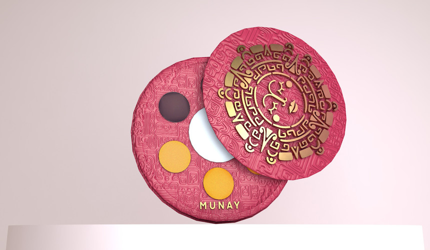
As soon as the branding was created, it was easier to create the packaging for the products. To give the packaging a touch of elegance and exclusivity, I used gold finishes and textures, the texture is made up of Inca symbols.

3D packaging design


Using classic makeup collections as a reference and the Chinese brand Florasis as a modern reference, I designed packaging that incorporates beautiful reliefs as well as a sober aesthetic.
To create 3D models of the products, the first step was to divide the products into simpler pieces, using the Cinema 4D program.

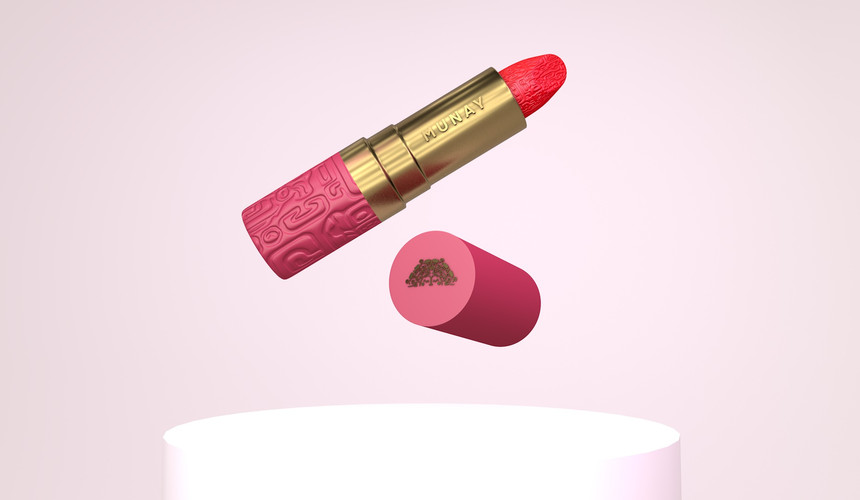


As a last step I animated the lipstick in a promotional video to present it.
Thanks for reding


Comments